Tag Archives: graphic design

Design, Bared

Posters in Mark's Cafe
Posters in Mark’s Cafe

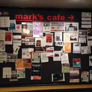
Tuesday’s workshop on graphic design with Marjan Gartland and William Hodgson was such a treat! I’m sure you have seen many of Marjan’s wonderful designs all over campus. I see them every day on crowded boards such as the one pictured here at Mark’s Cafe in Van Pelt-Dietrich Library Center competing for the attention of the Penn campus.

Marjan is the Visual Project Manager on the University Life Administration Team in the Division of the Vice Provost for University Life (VPUL). She helps create beautiful graphics for many purposes and audiences, serving the many departments in that division including the cultural resource centers and campus safety.

She brought dozens of posters to show us, and we enjoyed looking at them displayed on the walls of the Collaborative Classroom. Marjan and William shared their insider tips-and-tricks with us, and Marjan did a live demo of creating a graphic using PhotoShop and Illustrator. We talked about using tablets like our new Cintiq and tools like InDesign and Kuler.

Often, when I see a powerful poster, I have little understanding of how it came to be. What I found most helpful about the workshop was watching a graphic take shape one step at a time, one tool at a time. Marjan started with a photo of a face and created a complex graphic in minutes!

I am looking forward to facilitating an online workshop in October with William on logo design and I hope you will join us.

New Poster Printer Prices

66230846-32b3-cd8f-fb43-a5e097056e47Due to rising costs, we’re changing our poster printing prices here at the Penn Libraries from 2.5 cents per sq. inch to 3 cents per sq. inch ($4/32 per sq. foot), effective March 7.

A 36″x48″ poster, for example, will now cost $51.84. (The very same poster would cost you $100 at Campus Copy or Kinkos/FedEx Office.)  We continue to accept only PennCash as a means of payment. For more exciting information on printing posters in the lab, be sure to check out our Poster Printer FAQ.

If you need help designing your poster, feel free to stop by the Vitale Digital Media Lab.

Redesign One Sign at a Time

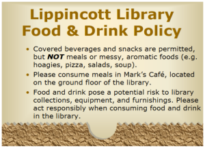
No one goes to the library to read—ugly signs that is. That’s why Lippincott’s own Business Librarian Melinda Roberts redesigned their food policy signs to be more visual. Congrats to Melinda! Her work was featured on the Librarian Design Share blog. Here are the old and redesigned signs:

Lippincott Library Old Food Policy SignLippincott Library New Food Policy Sign

Melinda doesn’t have a background in art but is surrounded by artists. She learned the basics of Adobe Illustrator, Photoshop and InDesign through WICshops. She’s taking on one sign at a time—including the redesign of Lippincott’s Research to Go poster.  She used a mix of serif and sanserif fonts, complementary colors, and design elements like rectangles and brackets to frame the content.

Lippincott Research to Go Poster

Here are Melinda’s tips for learning design programs, with a few design principles thrown in for good measure:

  1. Take a WICshop and get the basics. It’s so much easier to be shown how to do something the first time. You don’t have to remember it all.
  2. Google what you want to do. Somewhere out there is a person with a YouTube video about how to do it.
  3. Take advantage of your networks. If there’s something you don’t know, ask someone who does.
  4. Don’t use more than 3 fonts on any one piece (even though you really want to).
  5. Look for inspiration. Melinda says that she can’t necessarily create designs from her head, but she can look at what other people have done and build on it or adapt it.
  6. No one wants to read text. Use more graphics and fewer words.

Design WICshops are offered all the time—Find or request one soon!

H+U+D: Humanities, Urbanism, and Design Project

H+U+DThe School of Arts and Sciences, PennDesign, and the Penn Institute of Urban Research are putting forth a joint call for research proposals for the 2014-2015 academic year. The Mellon Humanities, Urbanism, and Design (H+U+D) Project is aimed at interdisciplinary design/humanities projects at both the undergraduate and graduate levels. The maximum award is $2000 per proposal to be spent on travel, archival charges, and photography. The project is made possible through the Andrew W. Mellon Foundation for a five-year collaborative initiative at Penn called Fulfilling and Liveable Cities: Design, Urban Life and the Humanities, as described in an Almanac article from last year. Project proposals are due by April 14, 2014, and can be submitted according to instructions on the CURF website

Fulfilling and Livable Cities: Design, Urban Life and the Humanities – See more at: http://www.upenn.edu/almanac/volumes/v59/n31/mellon.html#sthash.YCk5cHIq.dpuf

The H+U+D Project provides a rich opportunity for students of all levels to engage in work that impacts multiple fields of study. It’s also a great chance to explore new media while researching, a topic that is near and dear to all of us here at WIC. If your research involves digital scholarship or design, or if you would like to learn more about these topics, please stop by WIC (especially the Vitale Digital Media Lab) or drop us a line at wic1@pobox.upenn.edu.

Finding and Installing Fonts

This is the first PennWIC post from Alexis Morris, a graduate intern at the Education Commons. On April 3, Alexis will hold PhotoShop Design Office Hours at the EC.

Have you ever wanted to use a different font for a presentation other than what is available on your computer?  Here is a quick how-to on finding and installing fonts onto your machine.

Finding Fonts

There are many sites that offer free font designs.  A simple Google search will yield many results, however I have found that my two most favorite sites are 1001 Fonts and Da Font. Both offer fonts from the simple to the ornate, giving you many options to add some style to your work.  I prefer these sites because of the great displays and ease of navigation. Continue reading Finding and Installing Fonts

CURF Poster Showcase: Fall 2013

Each semester, we delight in attending the Center for Undergraduate Research & Fellowships (CURF) Undergraduate Research Symposium, where students present their original research on topics from musical topography to slum fires in cities. This September, David photographed some exemplary posters, highlighting their graphic design and visual literacy, popular topics here at WIC. Continue reading CURF Poster Showcase: Fall 2013

Divorce Infographics

divorce infographicMy fascination with infographics continues.  Yesterday, Lindsey showed me a Pinterest board she’d come across that collected infographics specifically about divorce.  It’s really interesting to see not just the variety of sub-topics within the “Divorce Infographic” genre (same-sex divorce, celebrity divorces, dating after divorce, child support, and even a holiday guide for divorced parents), but also the variety of ways in which the data itself is conveyed.  Most, as expected, are very statistical, but others are quite anecdotal in nature.  (Some, like the “Notorious Celeb Divorces of 2011” graphic, are downright gossipy even.)  There’s a good mix of charts and graphs, line art, photographs, and well-designed text.

Good infographics have a few common characteristics: First and foremost, they make you want to read them. They’re interesting to read–even if they’re on a not-so-interesting topic.  They’re eye-catching.  They use color well.  They’re usually graphical as well as text-based. And most importantly, of course, they effectively convey the relevant information to the reader.

Most of the 20-or-so infographics on the page have these qualities.  Check them over and get ideas for your own infographics, posters, and flyers. And remember we’re here in the Vitale Digital Media Lab to help you out along the way.

Designed in the Lab – Relay for Life Infographic

What is Relay InfographicChristine Uyemura, one of the lab consultants here at the Vitale Digital Media Lab, is the president of the group that organizes Relay for Life at Penn.  She created this very nice infographic about the event.  I wanted to share it with you because I wanted to see how effective you can be by using little more than text and some attractive colors.  The graphic manages to explain very clearly what the event is, why the event exists, what you can expect to see at the event, and how to find out more information–all using minimal graphical elements.

Christine is leaving candy in the lab this week and next to raise awareness of Relay for Life which is next Friday, April 5th on Franklin Field. Doors open at 6:30 and opening ceremonies are at 7:30.

I asked her to write something for this post explaining more about the event. Here’s what she says:

In case you don’t know, Relay for Life is the signature event of the American Cancer Society. It is an all-night event to Celebrate those that have won the fight against cancer,  Remember loved ones lost and Fight Back against the disease.  Throughout the night we will have performances by student entertainment groups including Strictly Funk (come see Victor!), Penn Dhamaka, Off the Beat, Sparks Dance Co., the Quaker Girls, Penn Masti, the Bloomers Band, the Penn Band, and Penn Pipes (Penn’s bagpipe club). Free food will be provided by Copa, Gia Pronto, Lil’ Pop Shop, Chipotle, Maggianos, Herr’s, Vitamin Water and more! The highlight of the night will be two special ceremonies at 10pm (Luminaria ceremony) and 1am (Fight Back ceremony) to honor those who have been touched by cancer.  Registration is only $10 and you can do it at http://www.relayatpenn.org – start a team or join one that already exists!

Relay is the largest philanthropic event on Penn’s campus. On average, we raise about $100,000 annually to continue the research, education, and patient/survivor support provided by the American Cancer Society. Our goal for this year is $75,000 and we really think we can surpass it if we get the word out so feel free to take candy and let any lab patrons know it’s for Relay!

Find more info about Relay for Life at Penn at http://www.relayatpenn.org/

Visual Literacy with Jung Lee

We had a great turnout at our Winter Break Lunch for faculty last week. Our guest presenter, Dr. Jung Lee, Professor of Instructional Technology at the Richard Stockton College of New Jersey, junglee prezishared a Prezi with ideas on how to incorporate visual literacy expectations into assignments in different disciplines. She gave several examples on what to avoid. I laughed out loud when she shared a graph where a student had sorted three sets of data on student achievement, numbered them and graphed them in comparison to each other – first generating a pattern and then discovering the same! She also shared an amusing photo of an out-of-business interior decoration business with rather unusual color sense.

The faculty attendees had several suggestions for WIC in terms of followup. They wanted to emphasize that visual literacy is gained by revising a graphic after feedback, similar to what happens in writing classes now – with peer review of writing. So why not explore peer review of graphics and presentations – before the presentations are finalized and shared in class? David Toccafondi dug out this great post on value added from February. We talked about the importance of telling stories with our graphics (instead of sprinkling them around wherever there might be some white space), and taking time to move from large chunks of text (that we may feel a bit possessive about after we author them) to visuals that make it easy on the learner. Stay tuned for more blog posts that build on visual design concepts like the alternative resume idea from this summer.